This article was originally published on TheFunPost
Now We All Want That Cleaning Product
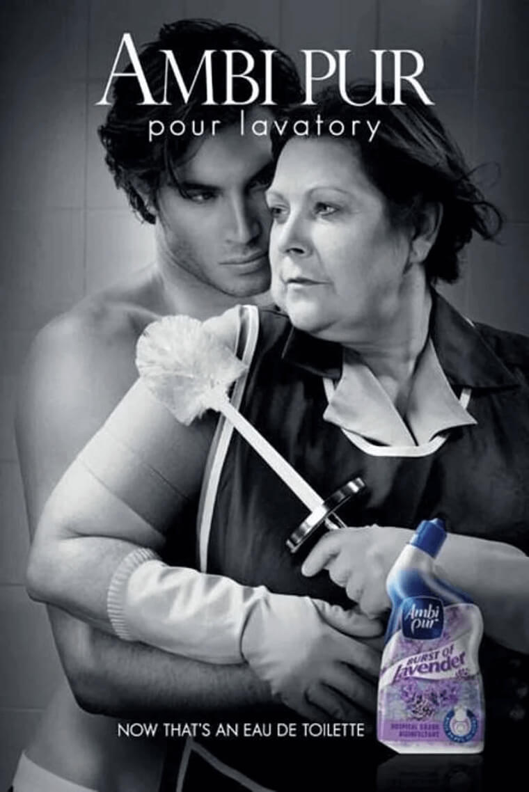
What's the first word that comes to mind when you think of cleaning products? Probably not the word "sexy," but this ad from Ambi Pur might just change your mind.
The smell is supposedly so fragrant it deserves to be marketed as a perfume ad, along with an attractive male model embracing the cleaning lady. Hilarious.
Evil Carrot's Revenge
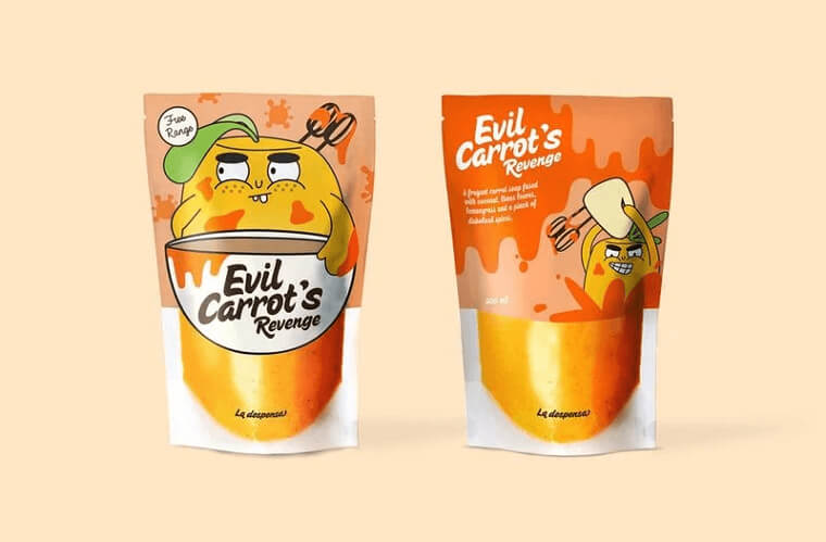
Who doesn't love a good food illustration? La Dispensa Soup has evil characters designed on their packaging, each one representing a different ingredient.
As we can see, their carrot soup shows a mixer stuck inside of an angry carrot, and the back has the angry carrot exacting his revenge. You show them Carrot!
Geek Humor
It's one thing to just be funny, but how many of us can be clever and funny? Axe nails this ad with a bit of geek humor.
For all you coders in Silicon Valley, this one's especially for you. And for the rest of us, let's be honest, we can still understand what it says in the ad.
Enjoy The Dark
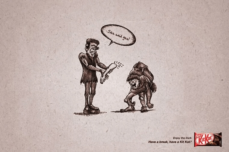
When you're trying to advertise for a product, one strategy is doing a play on words. In this case, Kit Kat was advertising their dark chocolate products, so they went in a direction of dark humor.
In this ad, a guy ripped off the arm of the creature he just asked to married saying, " She said yes!". Enjoy the dark indeed.
Binocular Pints
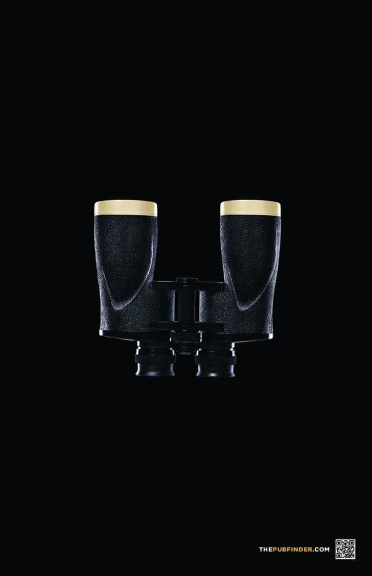
Before we even get to their ad, what do think of the company The Pub Finder? Who wouldn't want an easy way to locate the best pubs in the area?
Back to the ad though; this company has done a fantastic job at combining two concepts. Using pints for binoculars is pretty genius if you ask us.
Wouldn't You Want To Instagram These Cups?
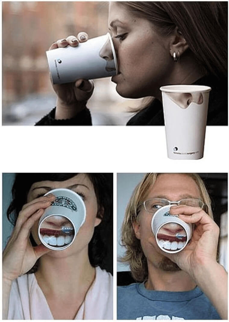
How amazing are these Starbucks coffee cups? Imagine if you saw someone drinking on a bench, and it looked like their nose had moved onto the outside of their cup!
Now the teeth one may look a bit less real, but they're still hilarious. These cups definitely got more people to buy coffee so they could play pranks on their friends.
Clever Handle Placement
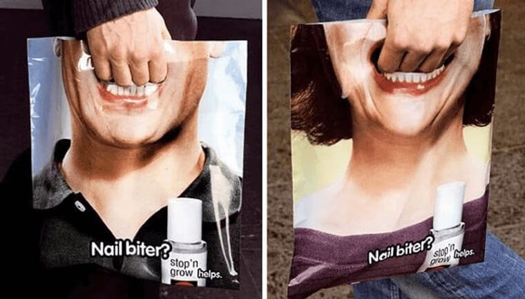
This image is quite frightening but also strangely appropriate for the product it's selling. Stop n' Grow offers a topical solution for people's bad nail habits.
What's great about their bag packaging is that the handle is at the opening of a mouth, making it look like the person on the bag is biting their nails. Bold, but we love it!
Billboard Creativity
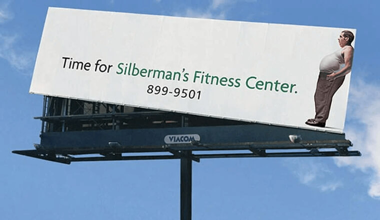
This billboard ad might be the most obvious one on this list. The billboard placement is very original and clever if you ask us.
Because the ad is advertising a fitness center, the man on the right appears to be tilting the billboard as if a scale is tipping. Sign up, or you might be the one tipping the scale next!
This Children's Hairdresser Knows How To Get Attention
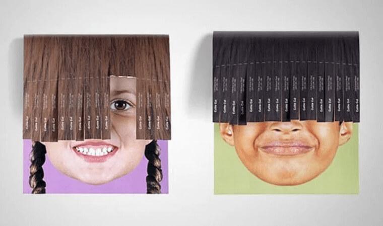
If this isn't the cutest ad, we don't know what is. Cuttie Cut, a children's hairdresser, wanted to promote their business in the best way possible.
Tear-off ads are a great way to get the word out locally, but this salon went a step further. They incorporated the tear-offs with the photos of children in a way that you just can't resist but to take one!
That Is One Strong Gecko Indeed!
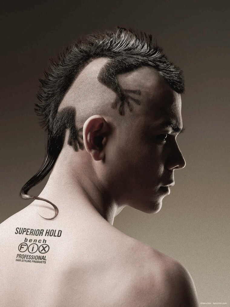
Hold on tight, because this Gecko isn't going anywhere! Maybe it's because of the superior hold of the styling product that Bench Fix is selling.
While this ad may be on the scarier side, Bench Fix does a great job of keeping us interested. We don't know about you, but the Gecko look is starting to grow on us.
The Worst Hotel In The World
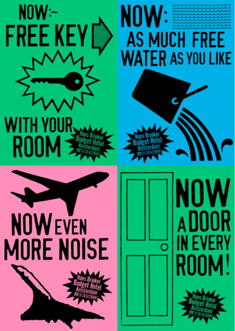
Sometimes being brutally honest is the best quality you can have. Amsterdam’s Hans Brinker Budget Hotel found out that they're the worst hotel in the world and can't even get a one-star review online.
Most places would take that as an incentive to up their rating, but Hans Brinker did an ad campaign bragging about their terrible status. Do you think it worked?
You May Need To Upgrade
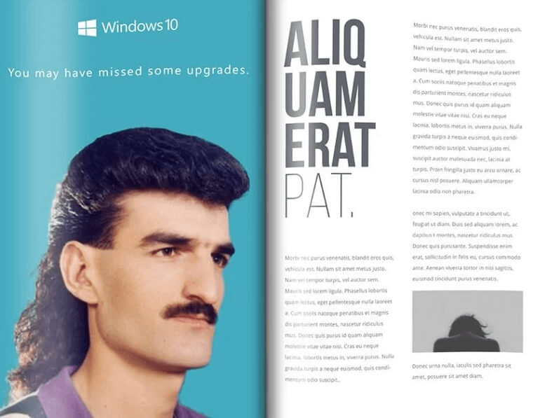
Windows10 is on point with their message and they're not playing around. They want to let you know that it's important to upgrade or you're going to be out of date.
And what better way to advertise this message than remind everyone of the worst hairstyle from the 1980s (or possibly of all time).
If Cookies Could Talk
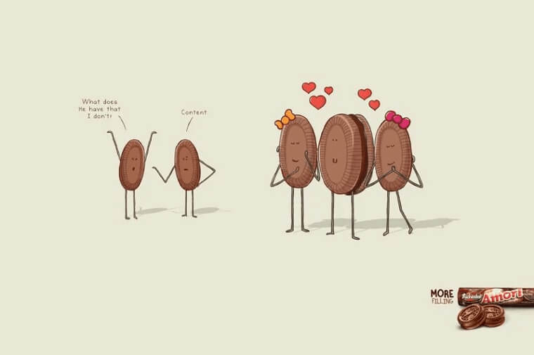
What's more adorable than cookies having a conversation? Amori, a cookie snack company, made a campaign highlighting their cookies with filling.
Two male cookies are jealous of another male cookie and are trying to figure out how he's attracting the female cookies. It's not always about what's on the surface - it's about what's inside.
The Possibilities Are Endless
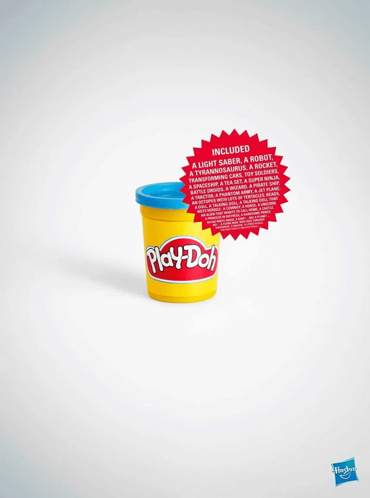
This ad is quite simple, but it could not be more perfect. Every kid likes Play-Doh. It's colorful, messy, and their imagination can run wild with the shapes they make.
Play-Doh's campaign lets you know that while there might be one small container, it holds all the shapes and designs you could think of, like a lightsaber, a super ninja, or an octopus with lots of tentacles.
A Classic New Yorker Joke
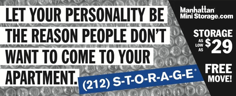
Want to call Manhattan Mini-Storage for your storage and moving needs? Their ads are all over New York City and are quite effective.
Manhattan Mini-Storage plays on NYC's famously cramped apartments so well you just can't help but call them. Next time you take a ride on the subway, take note of their hilarious ads.
Super Punny
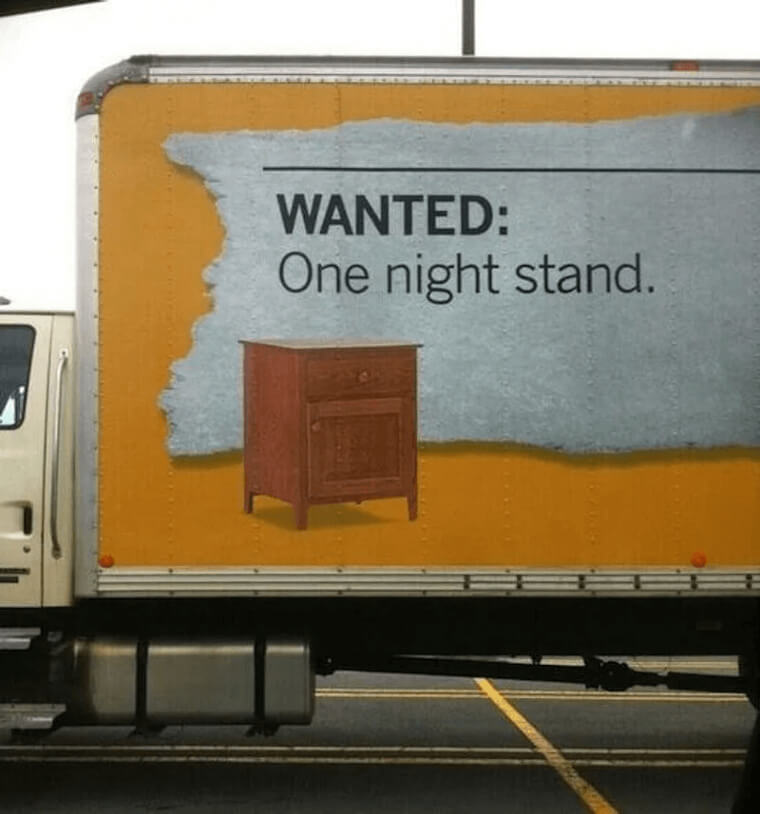
Some people love puns and others hate them. Regardless of which side you're on, you have to admit the wordplay here is clever.
Ikea is advertising their company with a photo of nightstand furniture, and we all know what one-night stands are, so we're going to assume you get the joke.
Be Careful With Your Charges
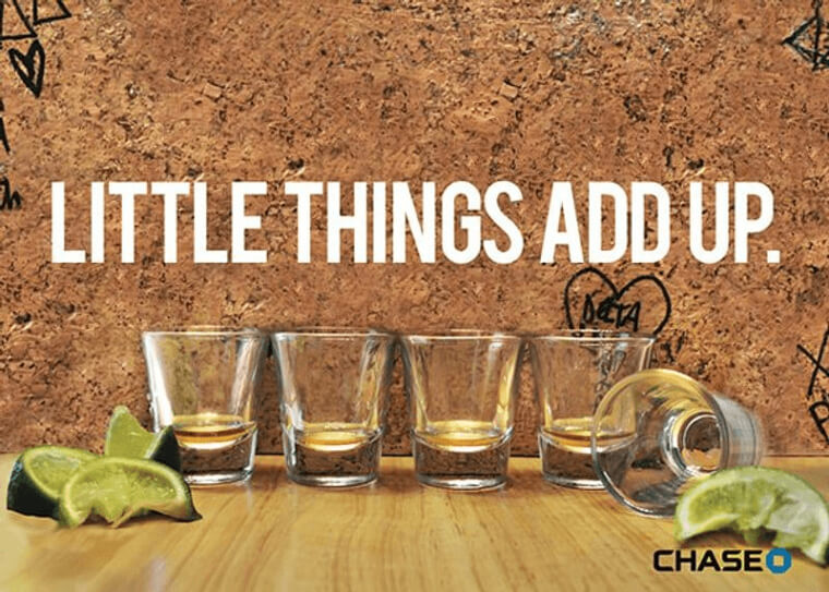
How many times have you had shots at a bar with your friends, and they say let's all do one more round? But then one more round turns into three.
Chase's ad hints at those nights with your friends. It may not seem like much, but those small drinks add up, just like your bank fees. Clever right?
Poo Poo Poo Poodle
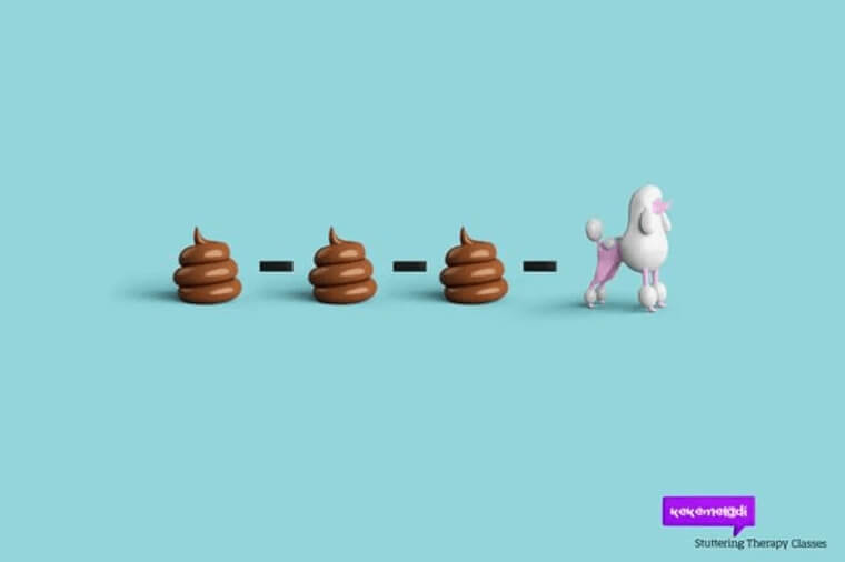
So how do you advertise for a speech therapy class? One way is by visualizing the sounds you're making throughout the entire process.
Kekemelodi Stuttering Therapy Classes came up with the idea to illustrate the stuttering sounds and the final word that you're trying to say. In this example, to say the word poodle, the first sound that comes out is "poo."
Low Life
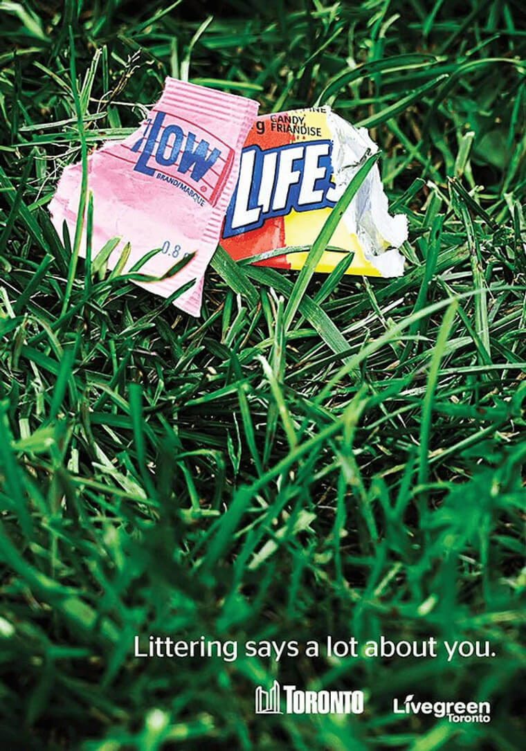
There are different tones that are used when comes to advertising - some ads are positive while some are more negative.
Toronto's Live Green organization is a program that encourages residents and businesses to be more conscious of the environment. This bold ad shows litter that spells out "low life," calling out and shaming litterers for their poor behavior.
A Smart Idea
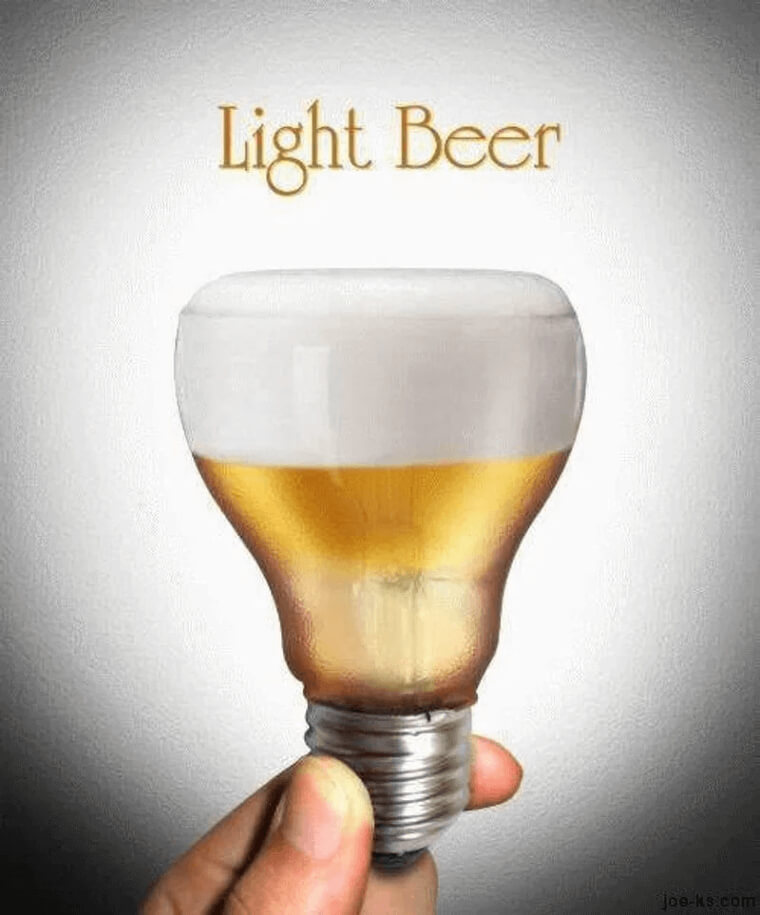
What's the visual that comes to mind when you have a great idea? A light bulb. Most illustrations that you've seen have someone having a great idea, and a light bulb pops up in their brain.
This beer company took that idea and combined a lightbulb with a light beer in a beer pint. It's a bit on the punny side, and it works pretty well.
Bold And Funny
Comedy Central is one of the best cable channels. Their shows are hilarious and extremely entertaining, so when it comes to their advertising, they can push the limits a bit further than most companies.
While it would be inappropriate for some companies to get provocative, for Comedy Central, it's right up their alley - as it says in their tagline, "In the right place, anything can be funny."
Look From Behind
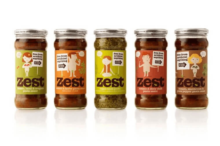
When it comes to food, there are many ways to include all the ingredients on the packaging, but we bet you didn't think about naked cartoon illustrations.
Zest pasta sauce wants you to know that their product is free from anything artificial, and these naturists are here to prove it - and not just with their signs.
Left And Right Together
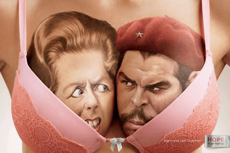
Just when we think we've seen it all, here's a campaign combining bras and politics. This unlikely combo is supposed to be symbolizing two political opponents working together... like the breasts that sit in your bra.
What do you guys think about this strange ad? We understand what Hope Super Push Up Bra was trying to do, but it's too weird for us.
It Started With An Ikea Bed
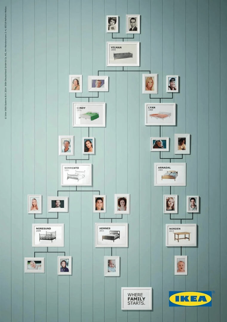
Did you know that 10 percent of Europeans were conceived on Ikea beds? After taking a good look at this family tree, you'll understand why we just gave you those stats.
Ikea nails their ad perfectly, showing the beds they've sold throughout the years and the babies that were conceived on them. Hilarious!
Happy Go Lucky
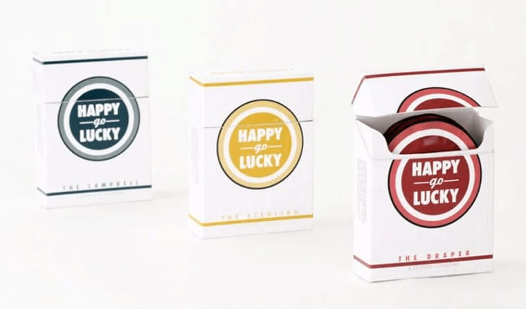
For all you Mad Men fans out there, you'll definitely appreciate this ad. A group of students created a campaign for their project with condoms packaged in a cigarette box.
The name Happy-go-Lucky package pays homage to the Lucky Strike cigarettes smoked in the popular AMC show Mad Men, complete with a very similar logo.
Hairy Brushes
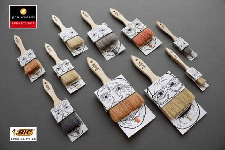
Adding 3D designs can immediately draw more attention to your ad. Before you even started to read what this ad was about, you were probably thinking how cool the paintbrush pops out of the page.
These "Poilu" brushes are pretty cool and play on the definition of the word. Poilu means hairy in French, and these brushes are meant to look like a mustache and goatee.
Bending And Stretching
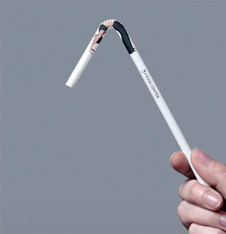
This Yoga Center ad is simple and effective. Yoga is all about bending, much like the straw in this photo.
As you can see, the woman in the straw is back bending, and you can only imagine what other poses she can do, like a downward dog or a sun salute. The 3D design is mesmerizing, and if we saw this in a restaurant, we'd probably be staring at it for a while.
Straight Out Of The Oven
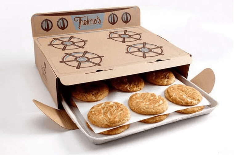
After staring at this photo, we all want to buy some cookies. Thelma's cookie ad has a cardboard box that looks like an old-school oven, and their cookies looked freshly baked and ready to eat!
A flat design would have been fine, but the lifelike illustration really brings the advertisement to a whole new level.
Breakfast ON A Bed
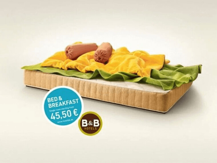
You've probably had breakfast in bed, but have you ever had breakfast on a bed? This Bed & Breakfast hotel gets creative with its visuals.
If you saw this ad on the street would you keep walking or stop to take an extra look? The idea of red pillows representing sausages and green and yellow blanket representing toppings on a mattress is odd, but also funny.
Is He In A Video Game?
What do you think is happening in this photo? The shoe company, Jim Rickey, created an ad for its "Honkey Kong" sneaker line.
What's different about this ad is that the vision is a tribute to classic 2D video games. The model in this campaign appears to be walking and jumping through the streets in his sneakers. How cool is that!
Knocked Out
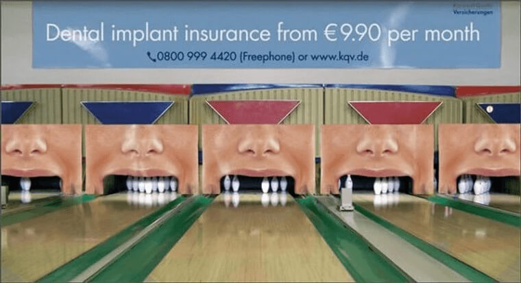
How would you like it if you lost your teeth? This insurance ad is making quite a bold statement and using strong visuals to get its message across.
Their ad shows bowling pins lined up inside people's mouths, letting people know that their teeth will fall out like bowling pins if they don't get dental implant insurance.
Not Just Any Doodle
This ad comes to show that simplicity might just be the best way to sell something. Kielo Travel, a travel management company, is subtly hinting at how badly you're dreaming of a vacation.
Your work binders are in front of you, but your mind wanders off, and now the ring binder looks like a swimming pool. We all know this feeling and are itching to book a resort as soon as we possibly can.
Checkups Are Important
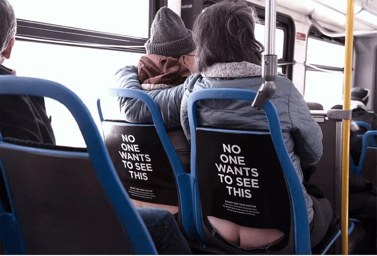
At first, this one looks like a funny ad, but when you read the fine print, it's actually about something serious. The boldness of the photo and the strategic seat placement was a great way to get the attention it needed for you to read what it's about.
Colon cancer is a serious matter, and checkups are extremely important. Like it says in the ad, "No one wants to this except for your doctor."
Clear Goals
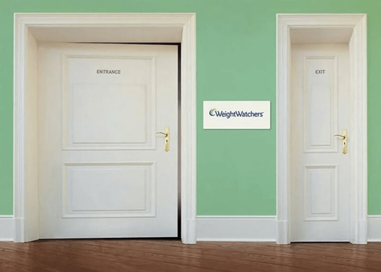
Goals are good to have in our everyday lives and they are especially important when it comes to losing weight. For Weight Watchers' ad, they expanded on this idea and created two doors - one that's wide and one that's thinner.
By the end of the program, the goal is to exit the door skinnier than how you started, similar to the sizes of the doors. Easier said than done, am I right?
Hip Hop For Everyone
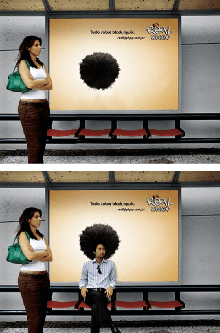
If you're confused by the black circle in the first photo, scroll down to the second one and you'll get a better picture of what this ad is about. This bus stop ad is pretty clever, and it actually involves everyone.
In fact, if you don't sit down under the illustration of black hair, the ad doesn't look right. This poster is a campaign to promote hip-hop music in Brazil, and if you sit down in front of the hair, it looks as if you have an afro.
Sleeping On The Job
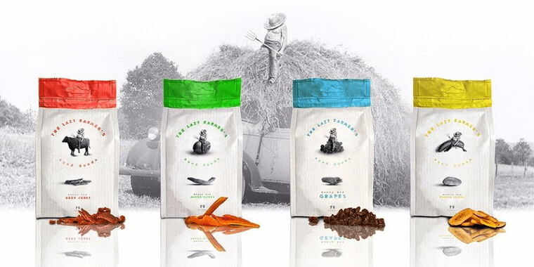
This farmer seems like the laziest guy we've ever seen - he's falling asleep on all of his food!
The company, The Lazy Farmer, sells dried fruit and the idea behind the ad is that the farmer got lazy on the job, so his fruits dried up. The concept is cute, and the picture of a farmer falling asleep on a banana just cracks us up!
Make Yoga Not War
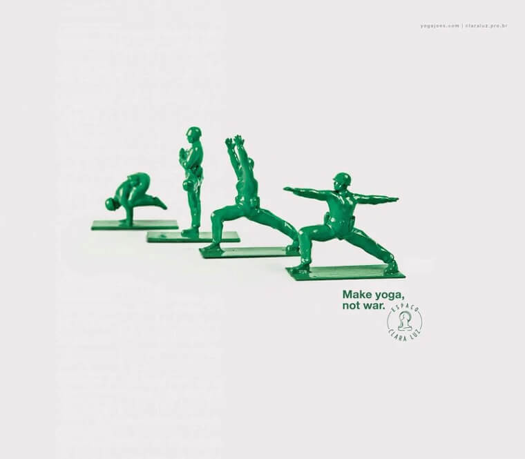
These are the funniest-looking toy soldiers we've ever seen! If we lived in Brazil, this photo would definitely get us to sign up for yoga.
The Brazilian yoga center, Espaco Clara Luz, used the famous saying from the 1960 "make love not war," with a slight twist. Smart and to the point.
Being Careful Costs Almost Nothing
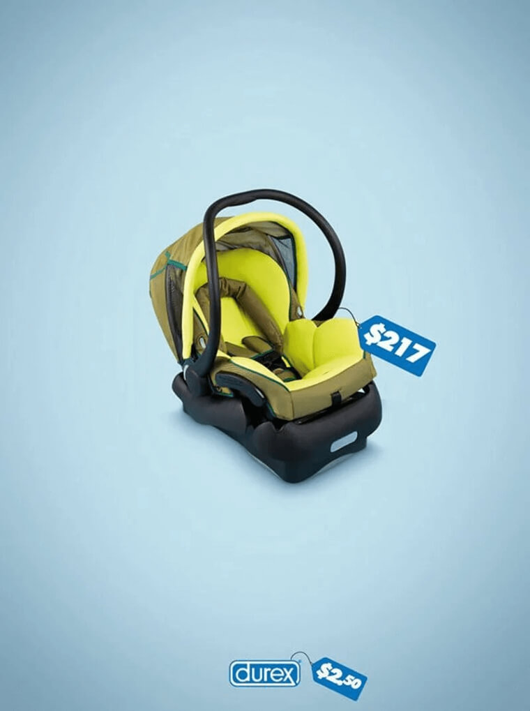
Why would you want to spend $217 on a baby car seat when you could have avoided it by buying Durex for only $2.50? This ad is poking fun, but the main message is pretty serious.
Durex nails the message with its simple baby car seat and price tag ad. You won't be spending money on expensive baby care if you're careful.
Before And After
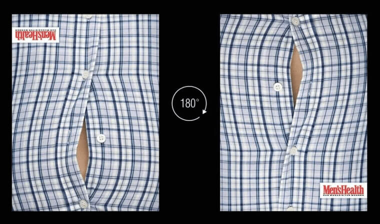
Is this the same picture just upside down? The answer is yes, and the reason is very clever. In this ad, Men's Health magazine designed a before and after picture, but the cool thing is that it used the same photo.
The before photo features a man's popped button from the stomach, and the after photo shows the popped button by his chest. Genius.
Only Two Kinds Of People
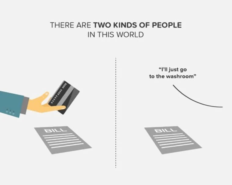
Don't we all want to find people who are similar to us? Zomato, a food delivery and dining app, created a series of ads representing two types of people.
In this particular one, some people pay for the bill after a meal, and others dine and dash. The concept is a funny way for customers to relate to different personalities, and we approve.
The Ultimate Showdown
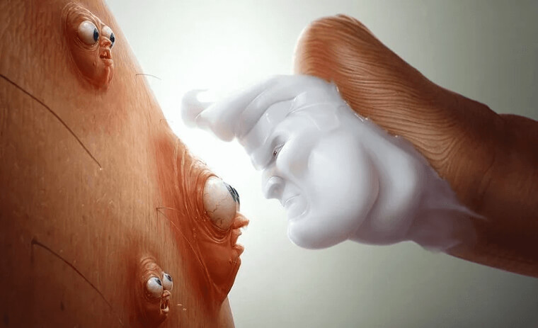
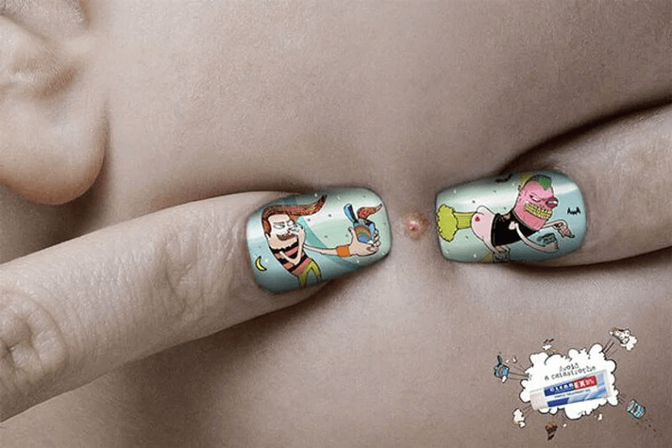
The terrified expressions on the acne's faces in this ad are priceless! This scene is a good guy vs. bad guy situation.
There's the stubborn acne, fighting to stay alive while the cream comes in to destroy the acne and save the day. This topical acne nailed their campaign with their creative illustrations, and we love it!
Adorable Expressions
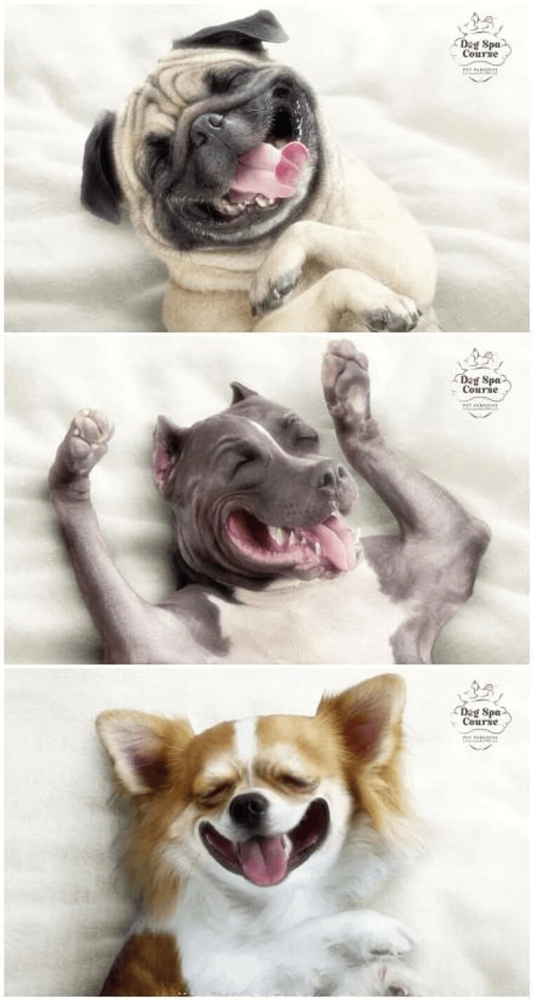
Let's be honest, having a dog is like having a best friend that loves you no matter what. So wouldn't you want to pamper your pup every now and then as a sign of gratitude?
The dogs in the Dog Spa Course ad campaign look like they're having the time of their lives and guess what - sign up, and your dog can too!
Waiting Their Turn
Unlike the last dog ad, this one has the dogs doing something quite different other than smiling for a photo. Yes, that's right, they're waiting in a line to use the toilet. The image is so absurd, but the ad does grab your attention
If you can stop laughing at the thought of dogs waiting for the bathroom then just know, the ad is actually laughing at us. This ad is for the dog festival Purina Bark in the Park, and is poking fun at the typically terrible bathroom situation during festivals.
You Are What You Wear
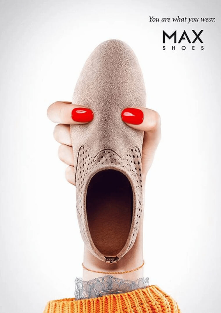
The slogan for this ad pretty much says it all. What you wear is more than just clothes - it represents who you are as a person.
The campaign features a person made from shoes, fingernails, and an arm, and we love the ad's creative flair. The gaping mouth is the creepiest and the best part of the ad, don't you think?
Fresh Out Of The Store
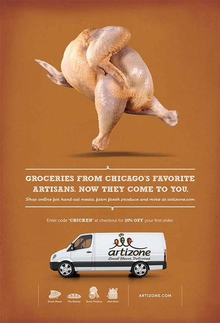
We don't know about you, but we can't stop staring at the walking chicken in this photo. Before reading the rest of the ad, we're already thinking about chickens taking over the world.
But seriously, this ad from Artizone is a Chicago grocery company that offers fresh meat and produce delivered to your home. Sounds yummy to us!
Let's Try To Avoid This
What were to happen if an explosion and a guy farting were to collide with each other? Clearex is here to tell you that you don't want to find out.
While the images may seem a bit graphic at first, the uneasiness is what sets this ad apart. Instead of a bad breakout, use Clearex and your acne will go away. Easy!
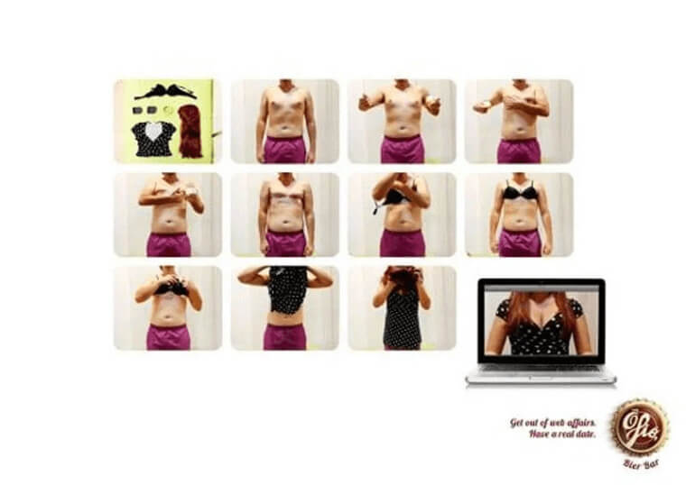
The Internet Is A Scary Place
The internet is scary, and when it comes to online dating, no one really knows if the person you're talking to is lying or even real at all! O Fio Bier Bar makes a really great ad telling people to get off their computer and meet other humans in real life.
In today's world of online dating, fewer people are meeting each other in person, and human interaction is important. And after seeing this ad, we might be too scared to date online ever again!
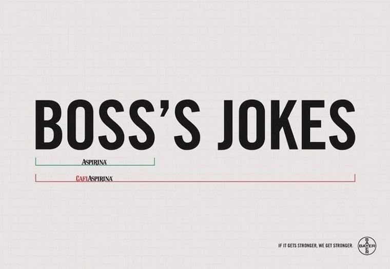
Sometimes You Need To Go Stronger
When do you need aspirin, and when do you need aspirin with a shot of caffeine? Bayer is here to explain it to you. They created a clever series of ads that involve different scenarios for their new aspirin, CafiAspirina.
In this ad, it says that dealing with your boss requires Aspirina, but if you're forced to listen to his awful jokes, CafiAspirina is the way to go.
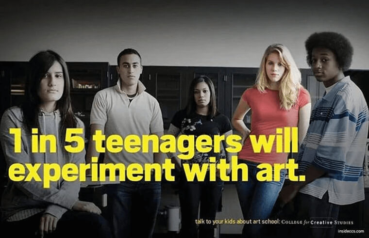
A Different Kind Of PSA
One in five teenagers will experiment with art? That's a pretty alarming statistic... we're just joking.
This ad created by students for the College for Creative Studies models their clever ad after teenage anti-drug PSAs, and we think the ad immediately captures the reader's attention. Not only is it a hilarious idea, but the kids' somber expressions are really on point.
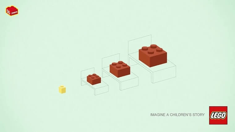
Goldilocks And The Three Legos
This clever ad is LEGO's take on a classic fairytale. Did you guess which one it is? You got it - Goldilocks and the Three Bears.
LEGO made a series of ads celebrating "55 years of bricks," and created a challenge to guess their graphic designs which were inspired by songs, movies, and other cultural events from the past 55 years. Pop culture and a LEGO challenge sound like the dream to us - bring it on!

